
COVER STORY – By Andria Cox
Increasing Accessibility in the New Virtual Workplace
Overnight, everyone, whether they know it or not, became ‘web developers’ of sorts.
For the foreseeable future, virtual work in some form is the new norm. We see large corporations using hybrid work models and empowering remote work for some extended period, and some are implementing 100% remote work indefinitely.
Remote work transformation from the COVID-19 pandemic is arguably the most rapid and transformational proof-of-concept in the latest decades regarding the physical location of one’s work engagement. Overnight, everyone, whether they know it or not, became “web developers” of sorts. Not in the traditional sense of a programmer, but as it pertains to creating deliverables for viewing on the web via a site, video chat, a mobile device or another form of web-based viewing.
Imagine Learning From Different Abilities
The world of accessible design is too broad to cover in one article. We will touch on a few considerations for anyone pursuing accessible design as a practice and show how appreciating materials from other perspectives is helpful.
Think about a time when you saw a PowerPoint (PPT), a PDF, a Word document, an eLearning or even a promotional infographic on a site and could not distinguish the text from the background. Perhaps you experienced lower engagement with the messaging or were apprehensive to take part in the discussion because of the inability to read what was on the screen.
 The next time you take a narrated eLearning, mute the narration, turn off the closed caption and hide the audio transcript. Take it again and engage with the narration. What extra context did you miss? Content without context often leads to discontent, memorization, and regurgitation. Narrations, unless for a compliance reason, should not read more than 50% of the onscreen content as they give the energy, tone, and context to enhance the content.
At Sanofi, we follow a federated learning model with a central Center of Expertise (CoE) composed of learning and development experts from across the organization. We work across the business and with the CoE to standardize practices and guidelines that increase the quality of the learner and enhance our learner’s experience.
Whether designing for 100,000 or two employees, “accessibility first” should be as commonplace as “mobile first.” Inclusion is key, and creating separate, complementary material upon receiving a request for an accessible document is not 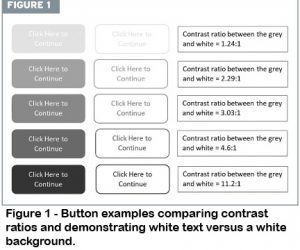 the answer.
When designing with accessibility from the start, we can mitigate learners having to ask for alternatives. Remember that increasing accessibility is not finite; it is an evolving goal. The more we know and appreciate, the better we can implement and improve. This article touches on media-agnostic accessibility along with a few eLearning and PPT considerations.
Media-Agnostic Accessibility: Color and Contrast
Put pastels in the past, even if they are in your brand palette or logo. Unless the pastel is an insignificant shape or has an appropriate outline and dark enough contrast with the accompanying text, foreground or background, light colors on light backgrounds do not work; nor does navy text on a black background.
Adhering to web contrast ratio standards applies to all materials. Doing so for text color and size, shapes, adjacent colors, and input controls bolsters readability and provides a more crisp and engaging appearance. Adhering to contrast ratio standards benefits everyone.
Some may ask: “What is a contrast ratio?” Excellent! Any color on top of or beside itself that has a contrast ratio of 1:1.
For visibility, at the bare minimum, depending on the stringency level to which you adhere, a shape needs a contrast ratio of 3:1 and text, depending on size and boldness, needs the same minimum or a stronger minimum of 4.5:1.
Like many things, the minimum should not always be the goal. Higher contrast yields higher readability and increased user perception. You and your organization should decide if you will follow Web Content Accessibility Guidelines (WCAG) 2.0 or 2.1 and level A, AA or AAA guidelines as a standard. There are many online contrast ratio calculators to help you ensure your coloring meets your selected standard.
Helpful tips:
- Use more than color to construct messaging. If you want to creatematerial on blood circulation through the heart, you cannot rely on blue to denote deoxygenated blood and red for oxygenated blood if your user is completely colorblind. Adding appropriate labels is necessary, improves the experience for everyone and helps ensure accessibility.
- Logos do not have to adhere to accessible contrast ratios. Just because a color is in your logo does not mean that it is a great color for text or shapes.
- White reflects all light, and this is why users prefer dark text on a light background. When text is close together and on a dark background, the light reflects and increases blurriness while decreasing readability for most users.
- When adding text over pictures or videos, place a semi-transparent bar behind the text that meets contrast ratios to the text color and complements the video or picture theme. Wording, even if white text with a black outline, often disappears when video background changes or if the picture behind it has areas of conflicting contrast.
- Avoid color gradients behind or within text unless they meet contrast ratios.
 Alternative Text
If your user does not clearly see images, icons, navigation buttons, or the like, these elements become useless at best and confusing at worst. Provide a text equivalent, or
alternative text (alt text), for these elements. PPT, Word, Adobe PDF, and most eLearning authoring tools have built-in features for writing short alt text descriptors. Without alt text, when a user navigates images while using a screen reader, they will hear “picture,” “icon,” “chart,” “graph,” and so on.
Using the heart circulation example, most users will be able to tell that there is an image, icon, etc. It is better to add a more specific descriptor like “flow of deoxygenated blood into and oxygenated blood out from the heart” rather than vague alt text like, “Image of blood flow through the heart.” As alt text is a short descriptor, if a lengthier descriptor is necessary, make sure to have supporting onscreen text. There are many helpful tips, lists of rules, and examples of alt text online.
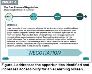
 Media-Specific Accessibility: eLearning
Include closed captioning that aligns with the spoken word in eLearning narrations.
Doing so can help learners learn a new language and increase comprehension if the narrator has a faster cadence. Incorporating a tab for the audio transcription per-screen allows the learner to read at their pace instead of the narration’s timing. Please use caution when including a PDF of the entire audio transcription instead of adding per-screen transcription. A separate document necessitates the learner to split their attention between the screen and the transcription.
Player bars that allow the learner to play, pause, advance, rewind and replay add to learner control and can enhance the learning experience. Check the eLearning navigation, using the keyboard to complete the course. This can help users with temporary or permanent limitations in hand or wrist motion. Also note that the accessibility of different interactions varies across authoring tools.
PowerPoint
The phrase “death by PowerPoint” has a new meaning when considering accessibility. Busy backgrounds with low contrast are ill-advised in general and provide an accessibility obstacle. Keeping backgrounds crisp and clean with proper contrast increases the clarity of the onscreen messaging. Other things that increase accessibility include simple animations and transitions that do not swirl, tumble or fly. Use appropriate text size and concise wording.
Standard PPT layouts ensure that screen readers convey the order and structure of the content from heading through the lowest bullet order in the content placeholder sections. While adding text boxes with different callout shapes in a customized slide layout is fun and sometimes necessary, screen readers read the text in these in the order of addition to the screen. Therefore, please be sure to “Arrange” the reading order in the “Selection Pane” to ensure appropriate message flow.
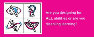
 Are you designing for all abilities or are you disabling learning?
PowerPoint, like most Microsoft Office applications, has an “accessibility checker” located in the “Info” section under the “Check for Issues” button. As with eLearning screens, if your PPT has a narration, make sure you include the narration transcript per slide. As a nice exercise, run some of your previous PPTs through the built-in accessibility checker and see what you uncover.
What Now?
The pursuit of accessibility is a consistent endeavor and one that quickly becomes a passion. There is much more to explore, and the hope is that this article opens the door to consider new ways to increase the accessibility of your materials and learning
offerings.
Make sure you do not lose your messaging or impact because people cannot read or access what you present in web-viewing format. Increasing accessibility and visibility is one small thing we can do to make a big difference!
Andria Cox is global digital and learning design director for Sanofi. Email Andria at andria.cox@sanofi.com. The views and opinions expressed in this article are those of the author and should not be attributed to the author’s employer.